Photo Stories
-
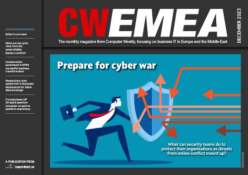 In The Current Issue:
- What are the cyber risks from the latest Middle Eastern conflict?
- Collaboration paramount in KPN’s successful business transformation
-
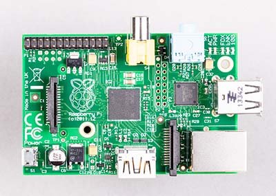
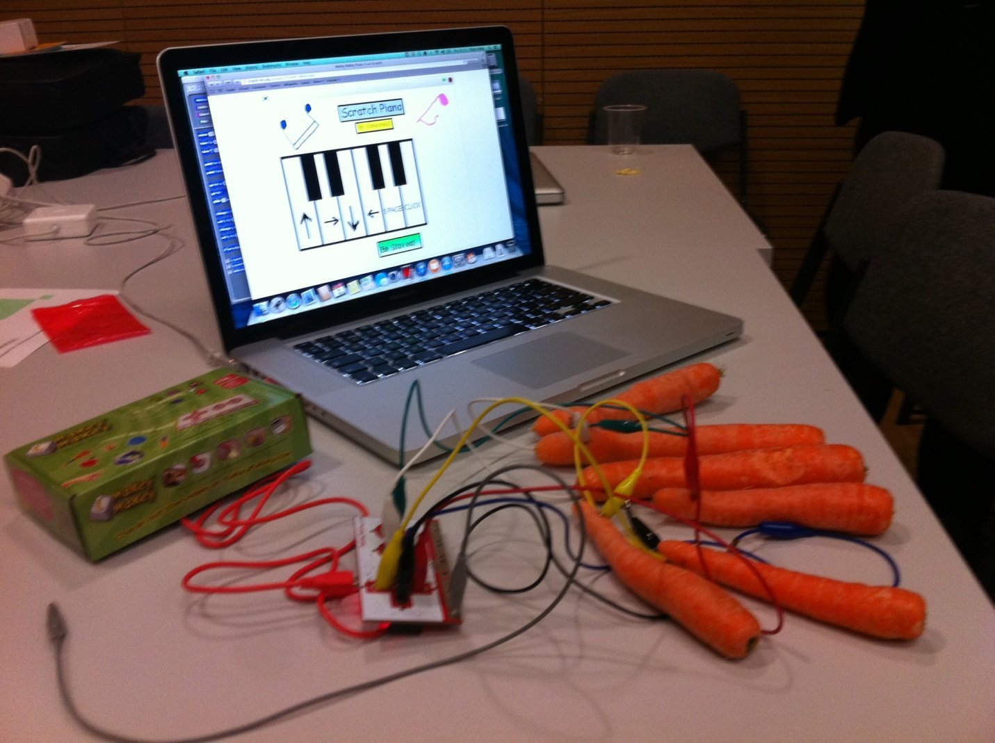
Raspberry Pi at 10
We celebrate the 10th anniversary of the Raspberry Pi computer
-
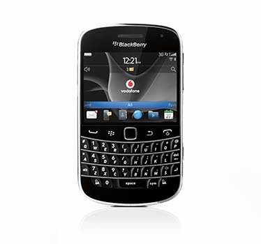
Blackberry OS end of support
The end of support for Blackberry's smartphone operating system represents the end of an era in mobile technology
-
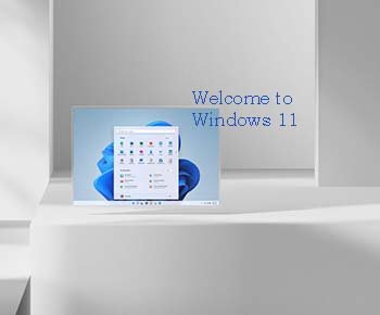
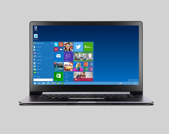
Windows 11: A first look
We look at the next version of the Windows operating system and see how it improves productivity, IT management and security
-
Important LGBTQ+ figures who shaped tech’s history
As the world celebrates Pride month, we take a deep dive into the lives of some of the people who have shaped the technology we use today, who are also LGBTQ+.
-

UKtech50 2021 – The most influential people in UK IT
Computer Weekly's annual search for the 50 most influential people in the UK tech scene is complete – meet the top 20 of 2021
-

Five easy tips to improve working from home networks
With many people having to work from home, we look at how to get the most from an existing broadband internet connection
-
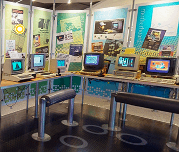
Preview of The National Museum of Computing’s virtual tour
We preview a new exhibition running at The National Museum of Computing
-

Computer Weekly/TechTarget UK IT priorities 2020
The annual Computer Weekly/TechTarget UK IT Priorities 2020 survey of 210 UK IT professionals looks at where IT budgets are being spent
-

Arpanet: 50 years of internetworking
50 years ago, researchers at Darpa, connected a group of computers together over a packet-switching network called Arpanet
-

SailGP: bringing sailing to a new audience with technology
Oracle founder Larry Ellison is bankrolling SailGP, a new high-performance yacht racing series that aims to use data analytics to attract a global audience to the sport
-
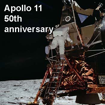
Apollo 11: From one small step to interplanetary computing
Neil Armstrong stepped onto the lunar surface on July 20, 1969. Computers in space have come a long way since then
-

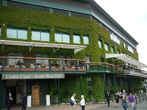
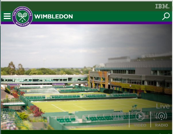
The technology that runs the Wimbledon 2019 tennis championship
Wimbledon is more than just a showcase for the best tennis - it also makes use of the latest technologies to bring the event to life for fans
-
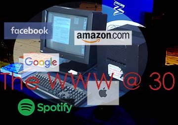
Web @ 30
It has been 30 years since Sir Tim Berners-Lee's initial proposal for the World Wide Web
-
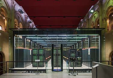
A datacentre in a church: Welcome to the Barcelona Supercomputing Centre
A chapel wouldn't be top of the list of locations for a supercomputer, but it’s the location for the Barcelona Supercomputing Centre
-
UKtech50 2018 – The most influential people in UK IT
Computer Weekly's annual search for the 50 most influential people in the UK tech scene is complete – meet the top 25 of 2018
-
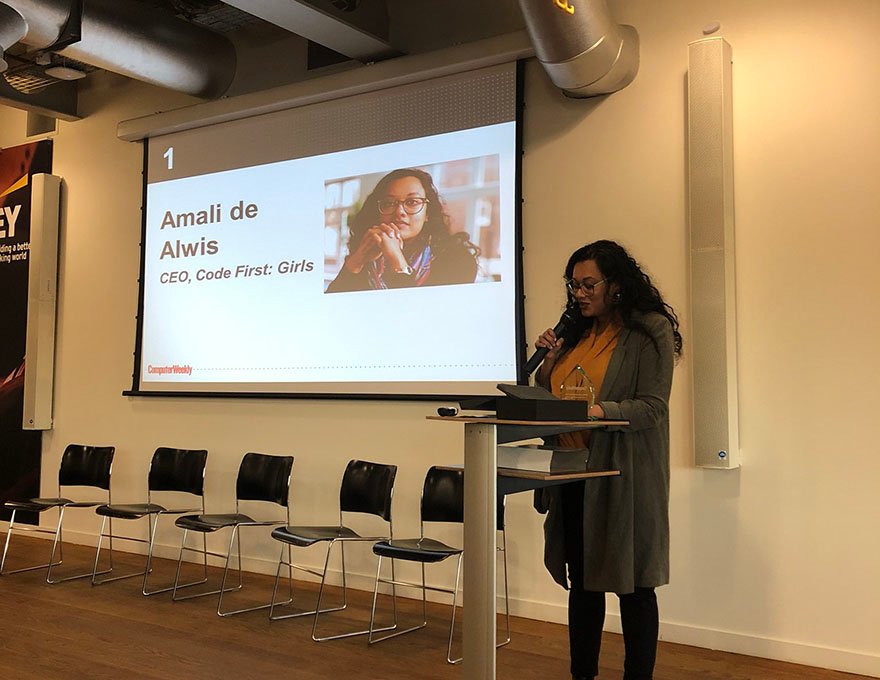
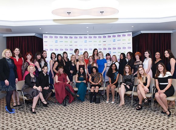
Role models pictured - Most Influential Women in UK technology 2018
Each year Computer Weekly showcases 50 of the most influential women in UK technology to make industry role models more visible and more accessible. Here is 2018's top 10 most influential women in UK technology, including this year's winner Amali de Alwis, CEO of Code First: Girls.
-

Motorola turns 90
The company's 90 year history has seen it broadcast messages from the Moon, power FM military transmitters and launch the first commercial mobile phone
-
Surface 2 family reboots desktop
Microsoft's latest range of Surface 2 devices provide tight integration with Windows 10, PowerBI and Office 365, giving users a new approach to working
-
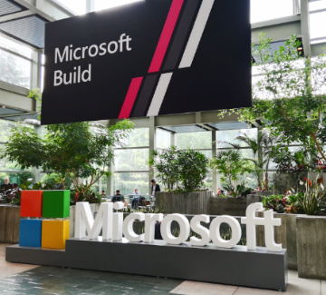
Build 2018: How Microsoft is embracing cross-platform development
Microsoft has realised the world is moving on from Windows. Azure supports Linux and Xamarin enables .Net developers to target IoS and Android devices
-
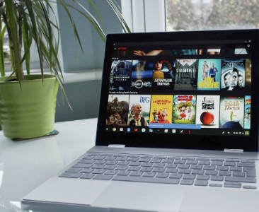
A month with the Google Pixelbook
We assess how well Google's Pixelbook premium Chromebook works in the enterprise
-

Mobile World Congress 2018: The key technologies and issues in mobile
Computer Weekly presents a round-up of the hot technologies and issues being discussed at Mobile World Congress 2018 in Barcelona
-
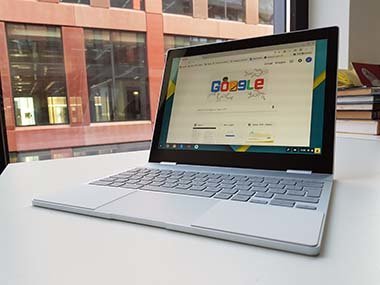
How to introduce Chrome OS in the enterprise
We test a corporate desktop IT environment, running on CloudReady, a version of Chrome OS that can run on PCs and Macs
-
UKtech50 2017 – The most influential people in UK IT
Computer Weekly's annual search for the 50 most influential people in the UK tech scene is complete – meet the top 25
-
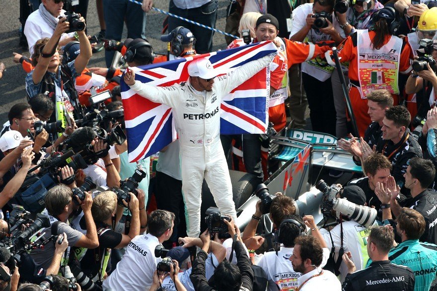
How data analytics helped Lewis Hamilton win the Formula One drivers' championship
Formula One constructors' champion Mercedes-AMG Petronas Motorsport worked with supplier Tibco to enhance its use of data
-
The 50 Most Influential Women in UK Tech 2017
Each year Computer Weekly recognises 50 of the most influential women in the UK IT industry. See pictures and bios for the Computer Weekly 50 Most Influential Women in UK Tech 2017
-
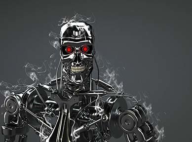
AI: A brief history of man versus machine intelligence
Over the last two decades machines have proved they can surpass humans at playing logical games
-
Wimbledon 2017: The tech behind the tennis
Each year IBM and Wimbledon work together to deliver an excellent sporting experience to both fans and players through the use of technology
-

Introducing Microsoft PowerShell
Real sys admins never use GUI tools. PowerShell offers command line tools for managing and automating Windows servers and Microsoft online services
-
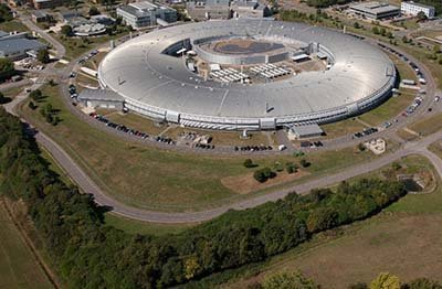
Inside Diamond Light Source, the UK's synchrotron facility
Computer Weekly recently visited the particle accelerator facility, to see how cutting edge software and hardware engineering is supporting pioneering science
-

MSC Cruises goes digital with Deloitte, Samsung and HPE
MSC Digital has worked with Deloitte, HPE and Samsung to build a digitally powered passenger services using tablets, kiosks, bluetooth and facial recognition
-
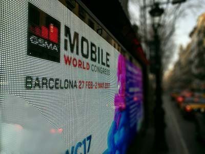
MWC 2017: An overview of what's going on at Mobile World Congress
We give a quick tour of some of the hot new technologies and trends on show at Mobile World Congress in Barcelona
-
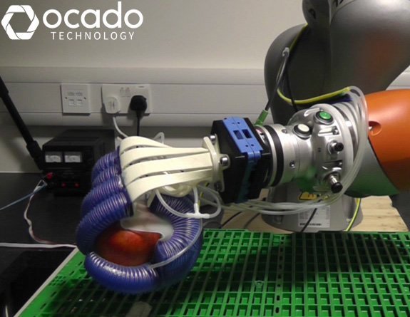
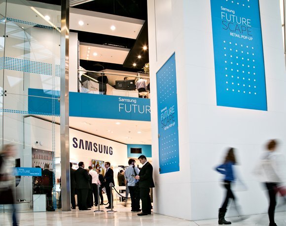
The technology transforming the retail industry
The retail space is evolving rapidly as brick-and-mortar stores try and compete with pureplays such as Amazon. Omni-channel retailing has increased the pressure on retailers to deliver a fast, reliable service whilst also ensuring their brand offers a personalised customer experience. This picture gallery looks at some of the technology innovations that are driving and transforming the retail industry such as in-store technology, robotics and artificial intelligence.
-
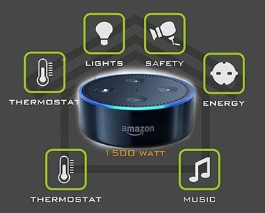
A guide to Alexa smart home integration
We look at how Amazon's voice service, Alexa, can be used to control smart home devices
-
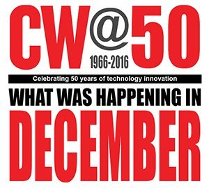
CW@50: News in December
A selection of significant articles from the Computer Weekly archives published in the month of December over the last few decades
-
UKtech50 2016 - The most influential people in UK IT
Computer Weekly has announced the seventh annual UKtech50, our definitive list of the movers and shakers in UK IT – the CIOs, industry executives, public servants and business leaders driving the role of technology in the UK economy
-
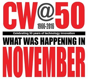
CW@50: News in November
The National Museum of Computing selects significant articles published in the month of November over the last few decades
-
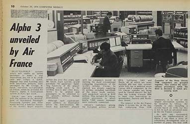
CW@50: News in October
The National Museum of Computing has been looking into Computer Weekly’s 50 years of magazine issues from the month of October
-
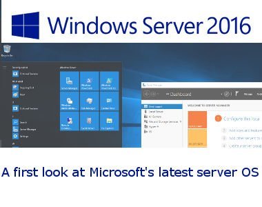
Windows Server 2016: A first look
Windows Server 2016 is a major release of Microsoft's server operating system, with more changes than in Windows Server 2012 R2 back in 2013
-
Computer Weekly: Fifty years of IT
On September 20, 1966, Computer Weekly launched. Fifty years on, we look at the state of IT, and where it is heading
-
CW@50: News in September
The National Museum of Computing has been looking into Computer Weekly’s 50 years of magazine issues from the month of September
-
CW@50: News in August
The National Museum of Computing has scanned in a selection of Computer Weekly’s articles from our archives
-
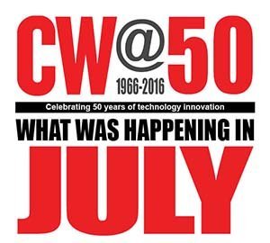
CW@50: News in July
In this month’s selection we have an article covering the July 1969 launch of Apollo 11 and Neil Armstrong’s “one small step.”
-

Most influential women in UK IT: Rising Stars 2016
Read about the judge's choice for the 2016 Computer Weekly most influential women in UK IT Rising Stars
-
The 50 most influential women in UK IT 2016
See pictures and bios for the Computer Weekly 50 most influential women in UK IT 2016
-
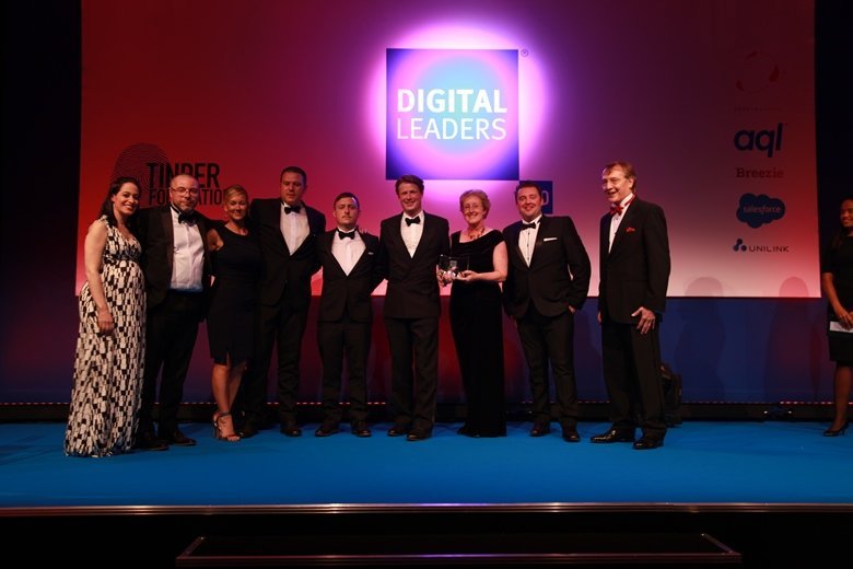
Digital Leaders 100 Awards 2016 winners
In a packed room at the Hilton Park Lane, the winners of the Digital Leaders 100 Awards (DL100) were revealed
-
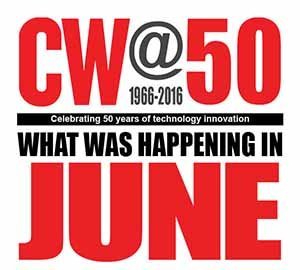
Computer Weekly@50: What was happening in IT in June over the years
Significant articles published in the month of June over the last few decades from the Computer Weekly archives at The National Museum of Computing
-
Trends in unified communications - Genband Perspectives16
Genband’s Perspectives16 show was staged in Orlando, Florida from May 2 to 5 2016. The event showcases Genband and its Kandy Platform-as-a-Service technology
-
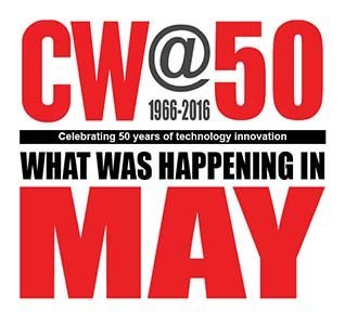
Computer Weekly@50: What was happening in IT in May over the years
CW@50: What was making the news in May?
-

How SNCF is using predictive analytics to keep trains running
The French rail operators has fitted internet sensors to its trains to improve maintenance and avoid breakdowns
-
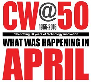
Computer Weekly@50: What was happening in IT in April over the years
We trawl The National Museum of Computing archives to present a history of IT, looking at what was happening in the month of April over the last 50 years
-

Broadband at 30,000 feet: on board with Gogo's 2Ku
Computer Weekly joined in-flight broadband provider Gogo on board their flying laboratory 30,000 feet above southern England to test out their speed claims
-
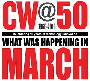
Computer Weekly@50: What happened in IT in March over the years
We search back through the Computer Weekly archives held at The National Museum of Computing to present what was happening in IT over the last five decades
-
FDM everywoman in technology awards 2016 winners
The everywoman in technology awards, sponsored in 2016 by FDM, are designed to showcase many of the great women working in science, technology, engineering and maths (Stem) careers.
-
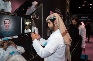
Future technology at the World Government Summit 2016
Delegates at the World Government Summit 2016 in Dubai discussed themes including the future role of governments, robotics and AI, smart cities, sustainable development, renewable energy and longevity.
-
UKtech50 2015 - The most influential people in UK IT
Computer Weekly's annual search for the 50 most influential people in the UK tech scene is complete - meet the winners
-
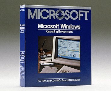
Windows @ 30: How it all began
Love it or hate it: Windows is 30 years old. The Microsoft graphical user interface has had a profound impact on the way people use computers
-
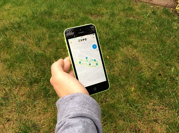
Expo Milano 2015 – Powered by Accenture
This year, Accenture supported the universal exhibition in Milan showcasing technology with the theme ‘Feeding the Planet, Energy for Life’
-

An introduction to the Microsoft Business Store
Microsoft is building a way to enable Windows 10 enterprise users get the business applications, enabling IT to deploy them centrally
-
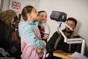
Aid organisations using technology to help Syrian refugees in the Middle East
Technology is playing a crucial role in supporting humanitarian aid organisations coping with the influx of Syrian refugees in the Middle East
-
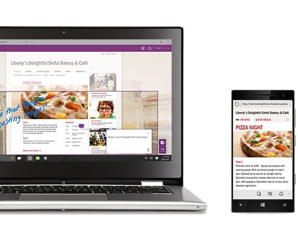
Inside Office 2016
Microsoft has released the latest version of MS Office. The new Office 2016 is all about collaboration and teamwork
-
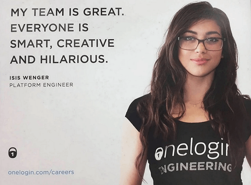
What is the #ILookLikeAnEngineer campaign?
We've pulled the best from the #ILookLikeAnEngineer campaign
-
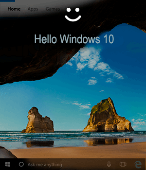
Welcome to Windows 10
Microsoft is launching the latest version of the Windows operating system. We look at the enterprise fetauress
-

The 50 most influential women in UK IT 2015
See pictures of those that made the top 50 most influential women in UK IT list for 2015
-

Most influential women in UK IT: Rising Stars 2015
Judges for Most Influential Women in UK IT hail five females as Rising Stars. Find out who made our Rising Stars gallery this year.
-
Wimbledon and IBM double up to take on digital
Wimbledon describes how it has used IBM technology to overhaul its website, mobile and social media strategies to improve fan experience.
-

Air Traffic Control gallery opens at The National Museum of Computing
Sponsored by Nats, the air traffic control gallery features IRIS radar, a restored PDP-11 and high definition air traffic control simulator
-
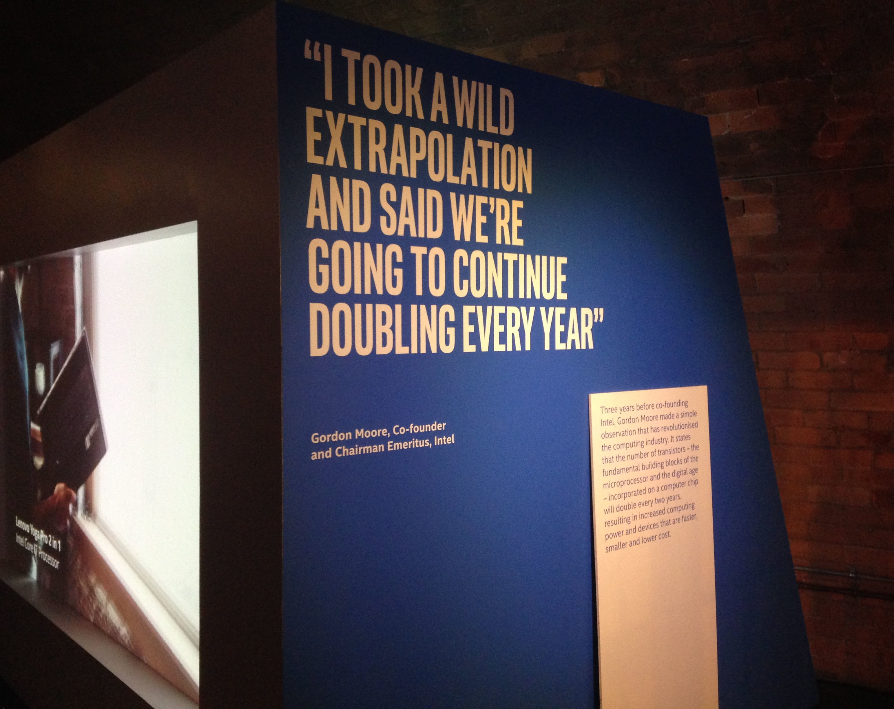
Intel future showcase – The past, present and future of technology
In this photostory we explore the past, present and future of technology and how Moore's law has driven innovation across the technology sector since its creation 50 years ago.
-
Microsoft Office 2016 Preview: A first look
We dive into Microsoft’s latest Office, now in public preview for enterprise Office 365 accounts
-
FDM everywoman in technology awards winners 2015
Find out the winners of the FDM everywoman in technology awards 2015
-
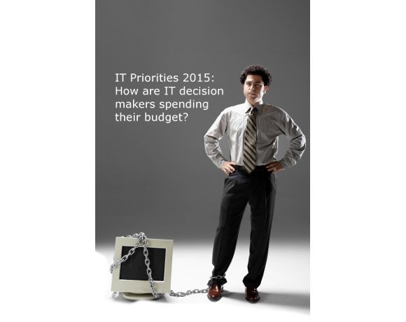
IT priorities 2015: How will IT decision makers spend this year's budget?
The 2015 Computer Weekly/TechTarget IT priorities survey has examined the investment plans of IT managers in the UK and Europe in 2015
-
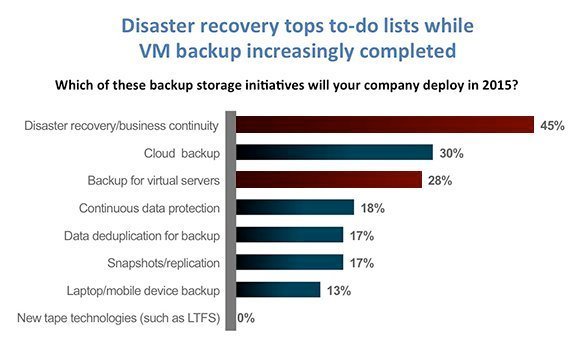
VM backup down as a priority while disaster recovery still tops to-do lists
Our survey finds VM backup increasingly “job done”, while disaster recovery, cloud storage, flash storage and mobility remain high priorities; but where is mobile backup?
-
Windows 10 Build 9926: A first look
We install and test-drive the latest build of Windows 10, which introduces desktop Cortana and Continuum for moving the GUI across devices
-
Universal apps in the enterprise
Windows 10 offers a new application platform, called universal apps. Should businesses consider using universal apps for new applications
-

Windows 10: Microsoft gets serious on upgrades
Microsoft will offer users of Windows 7, 8, 8.1, Windows Phone a free upgrade to Windows 10. Plus there is a hologram version
-
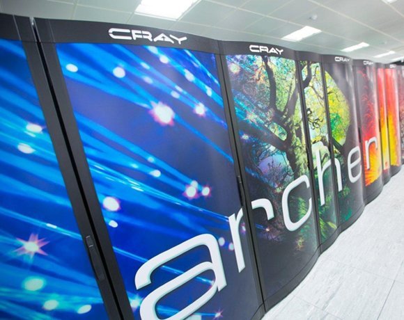
UK's fastest supercomputer upgrades to 2Pflops and 5PB of tiered storage
The UK's fastest supercomputer upgrades to 4,920 nodes and 2 Petaflops performance with tiered storage including 5PB of direct-attached disk
-

NRF 2015: how retailers are using technology to engage with customers
The National Retail Federation (NRF) conference 2015 took place in New York City between 11-14 January and Computer Weekly was on the ground reporting on all the trends from the show
-
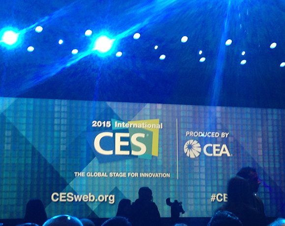
International CES 2015: The themes at the biggest tech show of the year
This Computer Weekly photo story explores the themes of this year's 2015 International Consumer Electronics Show held by CEA in Las Vegas.
-
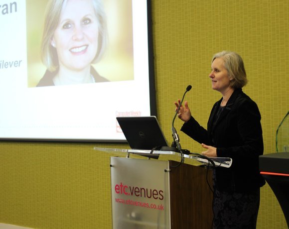
Computer Weekly's UKtech50 event 2014
Computer Weekly hosted its annual UKtech50 countdown event on 3rd December 2014. This year Jane Moran, CIO of Unilever took away the award for the most influential person in UK IT. Here are some photos from the day
-
UKtech50 2014 - The most influential people in UK IT
Computer Weekly has announced the fifth annual UKtech50, our definitive list of the movers and shakers in UK IT - the CIOs, industry executives, public servants and business leaders driving the role of technology in the UK economy
-
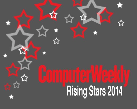
Computer Weekly UKtech50: Rising Stars 2014
Chosen by the Computer Weekly team from people we’ve met over the past 12 months, here are our five rising stars of 2014
-

Oracle: Five guaranteed cost-saving initiatives
There are plenty of pitfalls when dealing with Oracle licensing. here are five money-saving tips from The ITAM Review
-
Retail technology – what’s hot?
The world of retail technology is looking hotter than ever from gimmicky augmented reality penguins to serious CCTV solutions. Here’s the Computer Weekly roundup of the potentially disruptive technologies which are hitting the retail market.
-
Inside Kashiwa-no-ha: Hitachi Smart City near Tokyo
Hitachi shares what its Kashiwa-no-ha Smart City looks like near Tokyo, Japan.
-
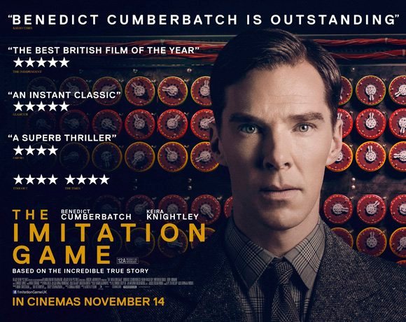
The real story behind The Imitation Game film
The life of Alan Turing is being celebrated on the big screen this month. The Imitation Game from Studio Canal opens on November 14th 2014 and tells the story of the war hero who’s achievements until recently were largely unknown.
-
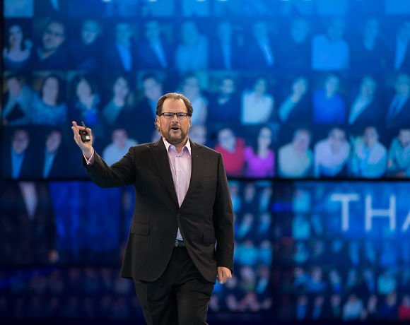
Making waves at Dreamforce 2014
Love him or hate him, Salesforce.com CEO Marc Benioff draws a crowd. This is a cloud software company with an increasing focus on application development
-
Central Saint Martins Creative Technology Day to inspire next generation
Central Saint Martins University of the Arts London hosted a day to inspire students to make technology instead of just consume it
-
Windows 10 Technical Preview: Installing and test drive Build 9841
We install Windows 10 Technical Preview Build 9841 on a virtual machine
-

Oracle Openworld 2014
Every September, San Francisco plays host to Oracle’s user conference, where customers, users and developers descend on the city to learn the latest on the supplier’s products and services.
-
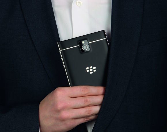
BlackBerry Passport: A first look
BlackBerry has changed the rules for phablets, with a an almost square device, promising 25 hours of battery life are highly readable screen
-

Avon Rubber implements Sage ERP X3
Avon Rubber’s history stretches back to 1885, when it began manufacturing rubber-based products, today the manufacturer has been working with UK software supplier Sage for its enterprise resource planning (ERP) tool
-

Larry Ellison: Of plane, sails and zen
After 35 years at the helm, Larry Ellison has stepped down as Oracle's CEO
-

Surrey makes strides in paperless policing
Surrey Police Force has been leading the way in paperless policing, with help from Airwave.
-
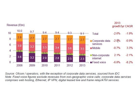
Business communications: the state of the market
Ofcom statistics reveal how the business communications market performed during 2013
-
Apple OS X Yosemite – How open beta will improve enterprise outlook
Apple recently submitted its most recent operating system, OS X Yosemite, for open beta. This move could signal greater opportunities for Apple in the enterprise.
-

Philips Connected Lighting - shining a light on the internet of things
In light of the internet of things era, Philips has been developing solutions for connected lighting that enhance office environments, streets and individual’s experiences by taking advantage of increased device connectivity. Here are some of the opportunities that Philips connected lighting could present to improve energy consumption and standard of living.
-
Rising Stars 2014: Most Influential Women in UK IT
During the judging process for the top 25 Most Influential Women in UK IT the judges felt that a Rising Star category needed to be added so a handful of the ladies could be acknowledged for their work and their potential.
-

Photo gallery: Top 25 Most Influential Women in UK IT 2014
View images and read the bios of the 25 most influential women in UK IT.
-
Wimbledon bunker tour: The IT behind the tennis championships
Computer Weekly goes behind the scenes at Wimbledon to investigate the technology supporting of one of the biggest tennis championships
-

A peek into Intel’s Internet of Things lab in Swindon
Intel's new IoT lab in Swindon is researching connected devices such as a connected coffee machine, targeted ads and live Twitter analyses
-
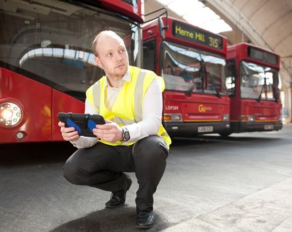
Go Ahead uses Huddle to improve mobility
Go-Ahead transport’s engineers are using Huddle for mobility and collaboration when maintaining its fleet of vehicles.
Videos
-
Diversity in tech 2023: Bev White, Nash Squared
-
Suki Fuller, most influential woman in UK tech 2023, winner’s speech

-
Diversity in tech 2022: Explaining employee resource groups
-
Diversity in tech 2022: Mehdi Mobayen-Rahni, Tyl by NatWest
-
Diversity in tech 2022: Kerensa Jennings, BT
Podcasts
-

The LEO story: A Computer Weekly Downtime Upload podcast
-
AI in fashion retail: A Computer Weekly Downtime Upload podcast
-
Empathy with business: A Computer Weekly Downtime Upload podcast
-
Agentic workflows: A Computer Weekly Downtime Upload podcast
-
Why AI won’t cut jobs: A Computer Weekly Downtime upload podcast
-
IT project success: A Computer Weekly Downtime Upload podcast