How to communicate amid a storm of data fatigue and misinformation

This is a guest blog by Andy Cotgreave, technology evangelist, Tableau
Charts: they’re all over the news. The NHS chief executive mocked others’ charts in their briefings; the science committee argued with Witty and Vallance about their charts; national statistics agencies are putting the government on the naughty step; and Marina Hyde is going to dress as a chart next Halloween.
While we all share the frustration, it’s not the charts that are at fault, and it’s also not possible to simplify something as complex as a pandemic down to a single number.
Some MPs, voicing the frustration of a tired public, are calling for church-fundraising thermometer style charts that simplify the entire Covid-19 situation into a single “easy to understand” number. In late October, former minister, Jake Berry, called for church-fundraising thermometer style charts that simplify the entire Covid-19 situation into a single “easy to understand” number. He claimed a single number would help people see their progress out of the Covid-19 crisis.
A church-fundraising thermometer works only if you can boil a situation down to a single key-performance-indicator. Church fundraising works because, well, you have one target: collect enough money to stop the church tower toppling. I asked Jake Berry what his Covid-19 thermometer would show? New infections? Average infections? Deaths in the last week? Economic impact? Days since the last Covid-19 case? Jobs retained? I’m yet to receive an answer.
Berry asks for “clear data” on the crisis. Unfortunately, understanding a complex situation requires displaying and interacting with multiple data sources: in this case, they do exist. It’s all there on ONS, NHS, and gov.uk: you just have to go and look. It takes time. It takes effort. This is no surprise to people in the business intelligence industry, but is a novel, frustrating reality the public have come to realise in 2020.
The governments across the UK have used charts in all their press conferences to communicate information. This is to be applauded, but a chart needs care and attention to be effective, which hasn’t always been evident.
Research shows that audiences have higher trust of arguments when supported with charts. The problem is charts are not truths, they are subjective. Simply changing colours and chart styles can tell completely different stories. As far back as 1858 Florence Nightingale deliberately designed her famous “rose diagrams” to tell a particular story, even as she was writing letters to her data-driven mentor William Farr saying “Statistics should be the driest of all reading.”
That trust can only be maintained if the charts are clear and understandable. How many times have you heard a minister, or advisor, show a slide and say “As you can see…” only for you to look at the chart and think, “Um, actually, I can’t see what the chart is telling me.”
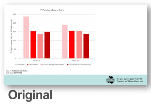
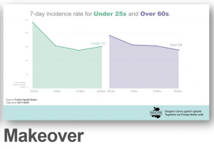
On 23 November, the Welsh Government’s briefing made a point that incidence ratings were going down for older people but rising again in younger people. This is an important point to communicate and a chart could help greatly. Unfortunately, they showed this chart. Go and look at the chart, and time how long it takes you to fully understand what it is showing. I remade the chart here. Which one is easier to parse? Which one engenders more trust in the author?
I was called out on Twitter for criticising the chart, but even on a simple chart like this, it’s vital to get this right. These briefings, like any presentation you or I might give, are the way we connect with an audience. The public give us their attention, and allocate their trust according to the clarity of the message.
Imagine if I was a minister and asked you to read a Whitepaper. Upon opening it, you found it used Comic Sans font, was full of spelling mistakes, and hadn’t been proof-read. You’d dismiss me as a charlatan. And yet when it comes to charts on slides, we don’t pay the same attention to detail.
It is not acceptable to be lazy about communicating data, especially during this Covid-19 crisis. Charts on slides should be reviewed for accuracy and clarity as much as any written documents. In many cases, it’s clear that this does not happen. I believe this is in part due to shallow data literacy skills. It’s not ok to have one or two analysts who can build charts to be pasted into a PowerPoint deck.
Understanding how data and charts work are fundamental to all parts of our lives, as 2020 has shown. It might entertain to mock charts in press conferences, but it doesn’t solve the underlying problem that trust is built as part of an effective communication of complex information. Covid-19 is complex, the impacts are huge, and trust is thus the most important thing to maintain.