
arthead - stock.adobe.com
Covid-19 and the art and science of data visualisation
The pandemic has seen political leaders and civil servants using data visualisation like never before – but there is more to the art than meets the eye

The Covid-19 pandemic has seen political leaders and civil servants using data visualisation to describe the situation and justify their decisions. But it has also demonstrated that while software makes it easy to turn numbers into pictures, it requires skilled humans to do this well.
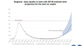
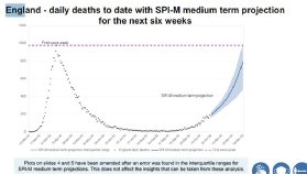
At a much-delayed press conference held at 6.30pm on 31 October 2020 – its timing apparently forced by the BBC’s unwillingness to delay Strictly Come Dancing – chief scientific adviser Sir Patrick Vallance presented a graph that predicted daily deaths in England rising from about 200 to 800 by 8 December. The graph included a range of predictions, with a worst-case figure of around 1,500.
This element of the graph was mistaken and the government republished the slides with the top of the range at just over 1,000 deaths a day. This prediction was wrong as well: 375 people died in England from Covid-19 on 8 December, although this was several weeks into new lockdown restrictions. (See the “before and after” graphs below).
Prime minister Boris Johnson announced these at the Halloween press conference, immediately after Vallance and chief medical officer Professor Chris Whitty had concluded their slides. “I am afraid that no responsible PM can ignore the message of those figures,” Johnson said by way of justification.
Before the specific error was discovered, the visualisations were criticised for being too detailed with tiny writing, scaring viewers rather than enlightening them. “This is a complicated slide,” Vallance said of one headed “England new SPI-M combined projection bed usage”. “Next Halloween I’m going as a graph,” tweeted Marina Hyde, a journalist at The Guardian.
“We’ve seen from government press conferences that less can sometimes be more, and keeping things simple can often be the best way to communicate with data,” says Gavin Freeguard, writer of Warning: Graphic Content, an email newsletter covering data visualisation. “You wouldn’t throw letters onto a page and hope they fall into crisp sentences and perfectly formed paragraphs that tell the story you want to tell. Yet too often, people throw numbers into charts and think that’s enough. It isn’t.”
Andy Cotgreave, technical evangelism director at visualisation software provider Tableau, says the charts used in the government’s Covid-19 press conferences should be checked as carefully as any written material. “It’s their space to communicate with clarity on behaviour change to a nervous public,” he says. “The interface has to be perfect.”
One problem is the re-use of visualisations in press conferences that have been designed for civil servants and politicians who are spending much of their lives tackling the pandemic. Cotgreave says the public versions should be simpler and presenters should spend more time explaining them, with a good rule being that viewers need to be able to understand a chart in less time than it takes to make it available for them to look at. “You don’t have to dumb things down, but you have to bring your audience with you if it’s complicated,” he says.
But there are dangers in designing charts to make them more accessible. This can be down to incompetence, with a graph of new local cases apparently broadcast by Fox31, a Denver television station, using a vertical x-axis that started at 30 then went up in semi-random divisions which represented 10, 30 or 50 cases. Artificial intelligence researcher Yann LeCun dubbed this a “laugharithmic scale”.
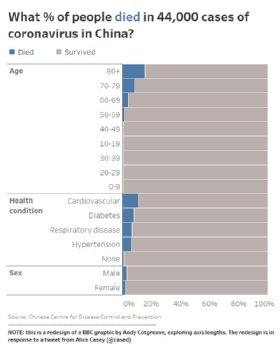
Better-designed visualisations can still be misleading, however. Last March, open data campaigner Alice Casey criticised BBC News for a bar chart that showed the proportions of people dying from Covid-19 based on age, health condition and sex, using data on 44,000 people in China. It was clearly labelled and included the source of the data.
But its horizontal y-axis ended at 15%, with this percentage shown only once at the bottom of three graphs. As a result, the bar for 80 and above fatality rate went almost all the way across the chart. “The visualisation kind of conveyed, ‘old people die of Covid’,” says Cotgreave.
He designed an alternative version that included those who died and those who survived, which showed that the oldest were most at risk, but also reflected that six out of seven of those aged 80 and above would survive. “The way I choose to show data will influence your interpretation,” he says. “People don’t realise that.”
Concern over how users will interpret data is why the Office for National Statistics (ONS) includes ranges of error on both visualisations and commentary on its weekly Covid-19 infection survey, run with the universities of Oxford and Manchester, Public Health England and health charity the Wellcome Trust. The research is based on test kits sent to a random sample of the population and is seen as one of the best data sources on the pandemic in the UK.
That is why those using it, including those in government, have to know its limitations, according to Rob Fry, ONS head of data visualisation. “There are life-changing decisions made off the back of this data,” he says. Error bars show the range within which statisticians are 95% confident the true number lies, illustrating its accuracy, he adds. “Knowing that number could be higher or could be lower could affect the decision.”
Fry runs a small team supporting data visualisation work at ONS. For most research, analysts draft charts in Microsoft Excel and a central publishing team adapts these using JavaScript libraries, primarily from Norwegian visualisation specialist Highcharts, as well as D3.js and Mapbox GL. The data visualisation team works directly on high-profile releases, including the Covid-19 infection survey, as well as providing training and guidance.
The team advises ONS staff to think about a visualisation’s key message and design it based on that. “You’ll avoid the temptation of trying to cram too much into the chart,” says Fry. They also tell colleagues to make charts self-contained with a title and annotation that emphasises the key message, so they work when used elsewhere. The ONS website encourages such re-use by providing links to embed and download visualisations.
ONS also publishes its style guide, allowing anyone to draw on its guidance. This includes advice on colour choices, including “get it right in black and white” to make charts accessible to those who are completely colour blind, “red and green should never be seen” as more common types of colour blindness make it difficult to distinguish between them, and “the safest hue is blue”.
Read more about Covid-19 and data visualisation
- Coronavirus: How data visualisation could build resilience against future pandemics.
- UK government coronavirus data flawed and misleading.
- German diabetes institute uses graph database to connect coronavirus research.
As well as Covid-19, Fry’s team is working on automatically generated visualisations of highly localised data from the Census that ONS is running in England and Wales on Sunday 21 March 2021, although this “Census Atlas” will not be available until next year. In the meantime, its work visualising the pandemic is being seen by millions: within two days of publication, 150 million tiles were requested from an interactive map of deaths, equivalent to about 10 million views. “It’s a very harrowing display of data, thinking of all the people and families behind those deaths,” says Fry.
Maps have been heavily used in visualising Covid-19. Berlin-based charting tool Datawrapper says maps made up 21% of all visualisations published through its system in 2020, up from 10% in 2017, although this is part of a long-term trend and line graphs also increased, from 19% in previous years to 23% in 2020.
Maps have their own challenges, such as whether to use a choropleth or heat map – where areas are coloured or shaded based on data – or symbols centred on a location, such as circles, the size of which is based on data. “What you choose depends on the question you are trying to answer for your viewers,” says Estella Geraghty, chief medical officer and health solutions director at California-based geographic software provider Esri.
A dashboard launched early in the pandemic by Johns Hopkins University in Baltimore used red circles, centred on countries and US states, with diameters reflecting case numbers, on a black and grey map. The stark design helped raise awareness, but also showed all cases equally.
This is difficult with choropleths when constituent areas vary a lot in size, with geographically tiny countries such as Singapore being near-invisible on a global scale. But it can make sense for data linked to political decisions. “If it’s a policy issue, you probably want the political boundaries,” says Geraghty. “Go back to: what am I trying to communicate?”
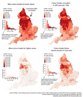
Choropleths have been used extensively in the UK and elsewhere to communicate Covid-19 case rates, but apparently minor choices can change what they communicate. During the Halloween press conference, Whitty used a map of case rates in England that showed much of the North and Midlands in a livid dark purple colour.
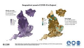
James Cheshire, a professor in geographic information and cartography at University College London, points out that the areas coloured deep purple had anything between 200 and 740 weekly cases per 100,000 people, while the first two colours covered narrow ranges of just 0 to 25 and 25 to 50.
“The choice made for this map over-emphasises small leaps in small numbers at the expense of big leaps in large numbers,” he writes. His reworking of the map with equal colour breaks based on the full range of case rates put most of England in the lightest shades, with only a few areas in the north in the most alarming colours.
One way to make maps work better is a blended approach, publishing them with tables, bar graphs and automatically generated commentary, something Californian data analytics provider Tibco Software has done with its Covid-19 dashboard. Chief analytics officer Michael O’Connell says this counteracts problems with choropleth maps, such as data on small areas getting lost. The dashboard also uses darker colours to highlight the previous week’s data on several charts.
The need to communicate numbers on Covid-19 has meant a steep learning curve for those using charts to do so. “Most big coronavirus dashboards and visualisations have been vastly improved over time – and others have copied their ideas,” says Lisa Charlotte Rost, a designer who writes Datawrapper’s blog. “Nowadays, I very rarely see a visualisation by a newsroom of any size that makes me cringe.”
But she adds that those visualising data on the pandemic need to remember that the numbers represent people. On a set of automatically updating charts that Datawrapper has generated since last March, deaths are shown in black to reflect respect, cases are in blue and recoveries in green. “I do think that some data visualisation creators don’t consider enough how their Covid-19 visualisation looks to people who have lost somebody to this disease, or who have it themselves,” says Rost.