Case study: Park Resorts engages customers through responsive website
Holiday resort management firm Park Resorts' recently launched responsive website delivers new features and improves the user experience

Holiday resort management firm Park Resorts has 48 sites across the UK, making it the country’s largest holiday park operator.
It has recently launched a responsive website, delivering new features and an improved user experience.
The firm's existing website was fully transactional, but it had been designed five years ago without the needs of current users in mind. In addition, it ran a separate mobile site. In December 2013, Park Resorts decided to update the sites, combining them into a single responsive site.
“We were fully aware we needed to update the website with a fresh design and user experience, so that was a large part of the reasoning behind the new website,” says Martin Abrams, head of digital for Park Resorts.
The holiday company had also made several changes to the website over its five years of service, layering new features over old, so it was important that the new website properly integrated all of these features to streamline the web experience, both for users and those adding functionality in the future.
Looking at the industry as a whole, Abrams points out the UK holiday park sector is behind the travel sector in terms of offering customers the mobile-centric experience they have come to expect. Park Resorts aimed to be one of the first to change that.
Bridging the gap
Abrams says Park Resorts needed a single system to bridge the mobile and online platforms, promote purchases to consumers and make analytics easier on the back-end technology.
“It does streamline certain things that we’re doing, particularly analytics and understanding what customers are doing on the site,” he says.
Read more on responsive websites
- Alpharooms drives mobile conversion with responsive design
- Case study: Goodwood Estate responds to mobile with responsive site
- Case study: Transport for London modernises website with HTML5
Having a separate mobile website required a separate analytics account, which made it more difficult to pair the data. It became harder to understand customers and their online needs, and almost impossible to track whether the same customers were using the website across both platforms.
“We thought having one website would make that a lot simpler and allow us to fully understand our customers' needs,” he says.
Abrams and his team realised that to fully understand the website’s customers and their needs, they would have to target the mobile audience as well.
Park Resorts needed a responsive site as it was experiencing a huge increase in the number of customers using the site on mobile devices.
“We’ve seen huge growth in mobile and tablet users, and across different areas of the business the growth has slightly differed. On the holiday side of the business you see a lot more traffic on mobile, but around the sales area of the business there’s a lot more traffic on desktop,” says Abrams.
When Abrams discovered mobile and tablet traffic was exceeding traffic from traditional PCs, he realised it needed to make changes to better target this increasingly mobile audience.
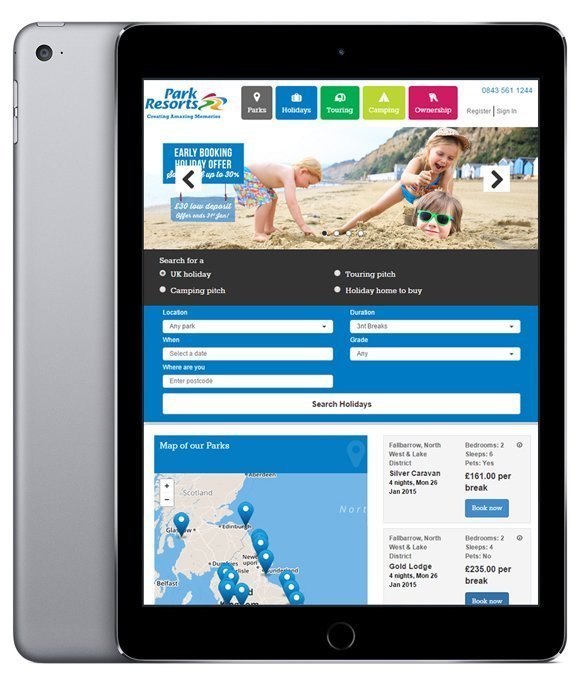
Park Resorts' responsive website was designed to improve user experience across all devices
A good mix
But Park Resorts does not now rely solely on its responsive site to accommodate customers. It also has two mobile apps, one aimed at caravan sales and one designed to provide information to customers on a Park Resort holiday.
Since the launch of these applications in 2014, there has been a huge surge in downloads, as people flock to the app for their buying and browsing needs.
But although the number of application downloads is growing, Abrams is finding that people still prefer to use the mobile site to search for caravans and plan their stay.
“It is certainly an area of growth, but most people are browsing Google. It’s much simpler to go to a mobile website – an app is quite a different experience,” he says.
“For researching the caravan park, we probably see more people using the app than the mobile site. But for more general browsing, the website definitely gets more traffic.”
Using analytics
Park Resorts currently uses Google Analytics to gauge where visitor traffic is coming from and what parts of the site are generating the most traffic.
The new responsive website has helped the company to more easily obtain information about the pages customers are looking at and how they’re interacting with the site, allowing it to optimise pages based on bounce rates and other metrics.
With the responsive site in place, Park Resorts is already seeing lower bounce rates and increased interaction with pages
If customers are finding navigation difficult or there is bad interaction with a page, Park Resorts aims to change these pages to make the customer experience more accessible.
“If we find, for instance, that customers are struggling to get from a certain page to actually search and book a holiday or search and enquire against a caravan, we adapt the page and make it a lot simpler for the customer journey,” says Abrams.
With the responsive site in place, the firm is already seeing lower bounce rates and increased interaction with pages.
Park Resorts is expecting an increase in the number of people who cross over to different platforms during different parts of the customer journey.
This will enable it to better keep track of individual customers and attempt to fully personalise the experience based on users as individuals.
“It’s a very different business to something like a retailer, where one person might make multiple purchases in a year. Our customers typically make one to two purchases a year, as they are bigger items,” says Abrams.
“That is a very important factor, and we need to understand our users much better in terms of multiple purchases.”
The agile development process
The responsive website took five months to build. The process was started by an external agency and finished in-house using an agile methodology.
Using an internal team helped keep project costs down and ensured the development team had a good understanding of the business and its needs.
We've not invented anything new, but it is a very simple user experience and customer journey
Martin Abrams, Park Resorts
The requirements of the project evolved as it moved forward, so the process involved regular huddles with different teams and stakeholders to ensure all requirements were met.
The site was launched incrementally in December 2014, initially rolled out to mobile devices. As the mobile division did not have much traffic at the time, and December is Park Resorts’ quietest month of the year, it allowed the development team to identify and fix problems without affecting many customers. The site went live on desktops and tablets a few days later.
“We had to be very agile in the first couple of days. I sat at developer’s desk for nearly two days straight,” says Abrams. “A number of things cropped up that were completely unforeseen, but we were able to get them fixed and implemented instantly.”
The team tried to make the new site easy to navigate, and to make it easier for customers to move from booking a holiday to buying a caravan.
A little over 18 months ago, mobile and tablet made up 30% of total traffic. Now they contribute 55%, and this figure is expected to increase every Christmas as device ownership grows.
More bookings are made by phone in the early months of the year, but an increase in online bookings is expected in July and August when customers prefer to book holidays as quickly as possible.
“We feel that the new site is a lot simpler, much easier to use and definitely conforms to what users are used to seeing across the internet,” concludes Abrams.
“We’ve not invented anything new, but it is very much a simple and easy-to-use website experience and customer journey.”
Read more on Tablet computers
-
![]()
Alcatel-Lucent, Nokia team to deliver end-to-end enterprise network services
By: Joe O’Halloran
-
![]()
O2 to upgrade Haven holiday parks mobile networks
By: Joe O’Halloran
-
![]()
UK government-funded mobile mast upgrades mark milestone in Wales
By: Joe O’Halloran
-
![]()
UK government upgrades over 50 existing mobile masts across nations
By: Joe O’Halloran