Facebook engineer builds heatmap tool for datacentre troubleshooting
A Facebook engineer has built a server-monitoring tool using heatmaps to assess the status of cache systems and fix datacentre problems
Facebook engineer Sean Lynch has developed a monitoring tool that uses heatmapping to gather data to spot problems and patterns in its IT infrastructure.
Lynch revealed the datacentre heatmapping tool on his blog.
Lynch and other engineers rely on the health of the cache systems in Facebook’s servers to identify problems and fix them.
Facebook has two major cache systems: Memcache, a simple look aside cache with most of its smarts in the client; and TAO, a caching graph database that does its own queries to MySQL.
“Between these two systems, we have literally thousands of charts, some of which are collected into dashboards showing various latency, request rate and error rate statistics collected by clients and servers,” Lynch said.
Increased complexity
Assessing graphs and dashboards was easy to start.
“But as Facebook grew both in size and complexity, it became more and more difficult to figure out which piece was broken when something went wrong,” Lynch explained.
Lynch wanted a tool that would help his team assess the status of each cache at a glance.
The new tool – Claspin, named after the protein that monitors for DNA damage in a cell – presents cache systems’ data in an easy-to-interpret format. But it was not easy to build.
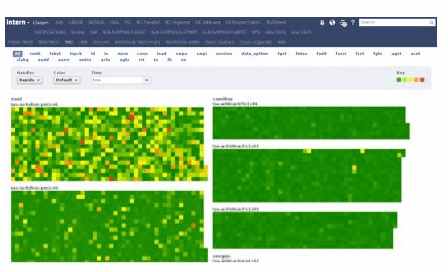
Lynch initially looked to encode information he had used for troubleshooting to create a system analogous to meters and traffic lights. But he could not build a binary tool that could say for sure if something was wrong or not. He then decided to use heatmaps.
“I'd been fond of heatmaps for quite a while,” he said. But this too led to problems because there were so many hosts and racks (multiple servers stacked one above the other), meaning he would need to use too many colours to represent all the metrics.
Hot host markers
“Eventually I realised that all we cared about was whether anything was wrong with a host,” Lynch said. “So I settled on coloring a host by its ‘hottest’ statistic, with hotness computed by different thresholds.
“Hosts that are missing a stat are colored black, indicating that the host is probably down.”
Lynch also developed a separate heatmap for every cluster (group of servers or other resources) ordered by rack number. Each rack was drawn vertically in an alternating "snake" pattern, so racks would stay contiguous even if they wrapped around the top or bottom.
The rack names are sorted by datacentre, then cluster, then row, helping the team identify the problems common at any of these levels easily.
The Claspin tool processes the data in the hosts, collects all the statistics on the server-side and sends them up to the browser. At the browser-level, colouring decisions are made in JavaScript and the heatmaps are drawn using scalable vector graphic (SVG).
“Even when a problem is ongoing, it's easy to see when things change because a particular problem will have a particular pattern on the screen,” Lynch said.